There is a huge difference between iron on transfer paper for light shirts and iron on transfer for dark shirts. Today I am going to explain those differences. First of all, the paper you buy should clearly state on the front if it is for dark fabrics or light fabrics. You can see in these pictures this is in the top right corner.
The light paper comes 10 to a pack and the dark paper comes 5 to a pack, so bear that in mind when planning your projects.
The biggest difference between the two papers though is the paper for light fabrics is clear and the paper for dark fabrics is white. This will make all the difference in creating your shirt. When you are making shirts with any type of paper, it is important to trim the paper. Even the clear paper will leave behind a trace of the paper, so the closer you trim the better overall look you will have.
Since printers do not print white, you have to use the paper to create white on your projects. The paper for light fabrics is clear, so any parts of your design that are white will show up as the color of the shirt. When you have white sections in your designs and use this paper, it will be best to put it on a white shirt so your white parts stay white. Here is an example of this:
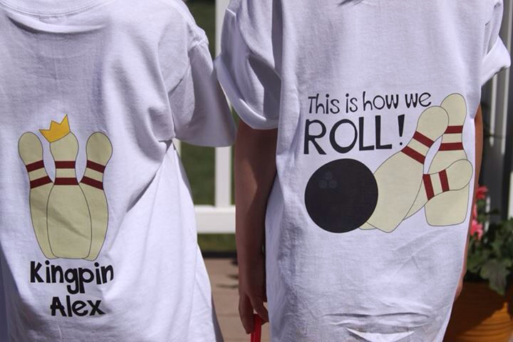
You can see the cream colored pins stay cream colored on this white shirt.
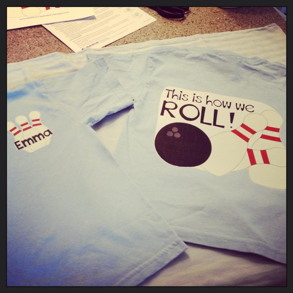
If you use the paper for light fabric with a design that has white/light parts on a color shirt, those white/light parts will be the color of the shirt. This is not wrong, just a different look then you might be going for. Here is an example of this:

You can see that the cream colored pins are now the grey color of the shirt.
The paper for dark fabrics is white. So the color of the shirt will not show through at all. But this is like printing to a white sheet of paper, so if you are unable to trim the design exactly you will have white around those parts. However, this is the only way to keep white sections of your design white on a color shirt. Here is an example of this:
You can see that the pins are white on this blue shirt, but there is also white around the lettering on this design. You just have to trim as best you can.
If you have a design with no white and black or dark colors only, you can use the clear paper to put it on a lighter colored shirt. This will give the illusion of floating text. Here is an example of that:

But remember this will not work with light colors in the design because the color of the shirt will over power it.
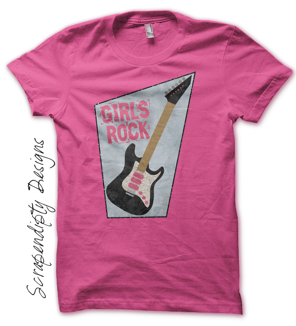
And a design that is easily trimmed out can be put on a color shirt with no problems using paper for dark fabrics. This will give you a very professional look. Here is an example:

Often if a design has text and someone wants to put it on a dark color shirt, I will suggest putting a border around the design. This will give an easy place to trim and I can put a little design inside the border so you don’t just have a stark white background from the paper for dark shirts. This is a great workaround for getting text on a darker shirt. Here is a mock-up example of this:
I hope this helps you choose which color shirt/type of paper you should be using in your projects! If you ever have any questions, please feel free to contact me and I am happy to help you decide what is best to use.
Happy crafting!
Rachel
A lot of information! But, I think I understand. I hope. Thanks!